One place for...
assignments
balances
notifications
events
tasks

client

Indiana University

role

Product designer
Let’s get in touch!
Summary

Overview

Brief

When the green light was given for our team to build yet another stand-alone application, I floated the idea of building an all-encompassing interface to host not only our applications but those of other departments. In Indiana University's current model, users must rely on a massive search engine to find and get to their destination, which means they always have to know what they're looking for. In an ocean of service offerings, students faculty, and staff are expected to navigate from one service island to another without any assistance. My proposal to bring together the most important, commonly-used features and services into "one continent" was both intriguing and novel, but most importantly, accepted.

Contributions

My contributions to this project included:
  • Brainstorming and creating the concept
  • Devising the information architecture
  • Designing visual interfaces, crafting application flows, and writing copy
  • Building the Figma soft prototype
  • Shopping the prototype with potential stakeholders
  • Presenting to leadership for director approval

Goals

Single interface

Provide users with a single interface to access key services and features

Personalized information

Display timely, relevant information chosen by the individual

Customizable content

Allow the user to determine which features and services are most desirable with a customizable dashboard

Information hierarchy

Consistent visual cues indicating the distinction between pertinent information, required tasks, and timely notifications

Discoverability

Improve service and status discoverability
Step 1

Discover

Discovery by...

Being curious

When I began working on the team that owned the account management tools at IU—like password reset and email forwarding—I was surprised to find there was no navigation between the tools, even though they were all built within the same application. When I inquired about this approach, it was explained that we were "all-in" on the search engine created by the university, and therefore, each application could, and should, stand alone. This seemed to undermine a few basic UX principles like discoverability and the whole concept of information architecture. But the search tool had been deemed a success, and one that other institutions were willing to pay to have as well.

Being scientific

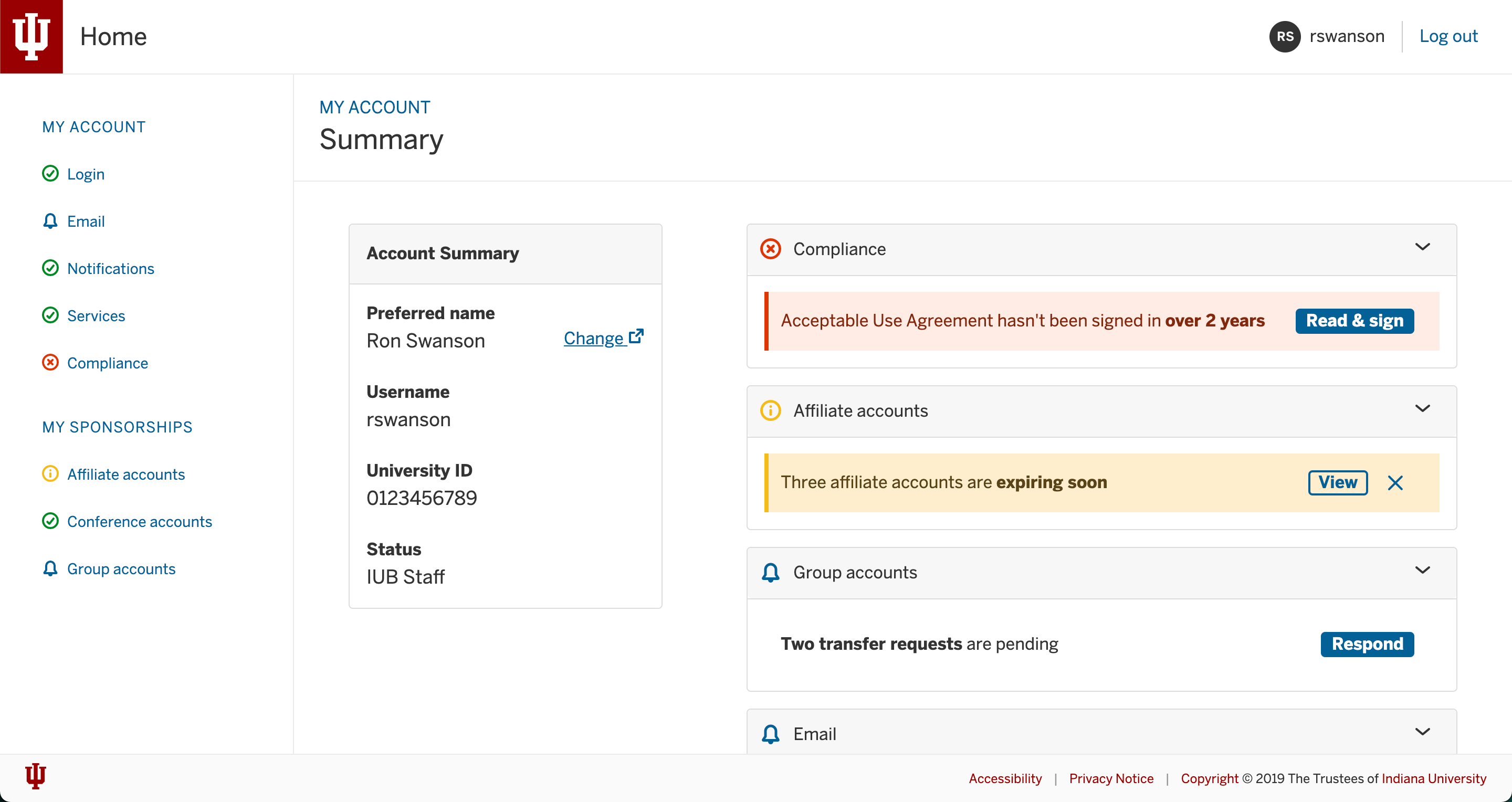
While on the accounts team, I was also a student pursing my Master of Information Science. For an assignment in my information architecture class, I had to create and design an application with multiple hierarchical levels . Naturally, I chose the suite of tools my team owned, wondering if it might validate my sneaking suspicion that users would greatly benefit from something as basic as navigation. Each of the account features was grouped into one of six categories, and a similar interface was applied to make the functionality recognizable across the application. When I presented this concept to my peers in class, I have to say I was surprised at just how well it was received as students expressed their interest for such a tool both during and after my presentation. Certainly, this was some validation for combining tools into a single interface.

Being creative

A few years after the warm reception from my class, I had an opportunity to explore the concept professionally. At the outset, I was given permission to pursue the single interface concept, combining all of our tools into one. To give users a reason to visit this application other than when they needed one of the tools, I also included various task-based features that would ensure an uninterrupted use of their account by displaying important status information. But as I began to ask what status information would draw the most value, I found other services like course registration and balance alerts.
What began as an account management tool quickly became an all-in-one dashboard to support our users' most pertinent goals.
Step 2

Ideate

Service selection

single interface
discoverability

Goal

Choose only high impact, actionable services
As hundreds of features and services from across the university's digital landscape could be included in this application, it was necessary to narrow the scope to only those that were commonly used, critical to success at the university (dependent upon status), and prompted action. This would provide the highest impact for users by allowing them to focus on what matters most.

Approach

Analyze search results
The university's sole mechanism for finding services collated lists of those that were most sought after. Simply perusing these lists revealed users' intentions.
Listen to others
Working at the university and taking classes with other students brought me into direct contact with the target audience. An open ear will hear lots of user cares, complaints, challenges, and confusion.
Apply personal experience
"You are not the user," should be posted at the top of every designer's monitor. This said, having legitimate experience as a user shouldn't be ignored. Having been both an undergraduate and graduate student at IU, I knew at least some of the services that were important to my studies and degree completion. The same was the case for being a current staff employee.

Information architecture

information heirarchy
discoverability

Goal

Organize services by category (not service owner)
The ownership of any one service at IU has been the product of over two centuries of evolution, and sometimes to what seems to be the detriment of those being served. While significant strides have been taken in recent years to bring meaningful alignment, it was necessary to ensure services were grouped by their broadly understood category and not the university owner.

Approach

To begin, I begin with a list of all of the services owned by my team. As an exercised, I grouped these by topic: login, email, compliance, etc. To expand this approach, I took a list of the most popular services and again combined them by category. Only a few seemed to be related to more than one category, but with each, a primary seemed to stand out. Of course, card sorting or usability testing could later be performed to reveal common patterns among users.

Initially, the broad categories, chosen based on the defined criteria, were:
  • Academics
  • Financials
  • Accounts
  • Notifications
  • Sponsorships

Widget templates

single interface

Goal

Create multi-purpose templates
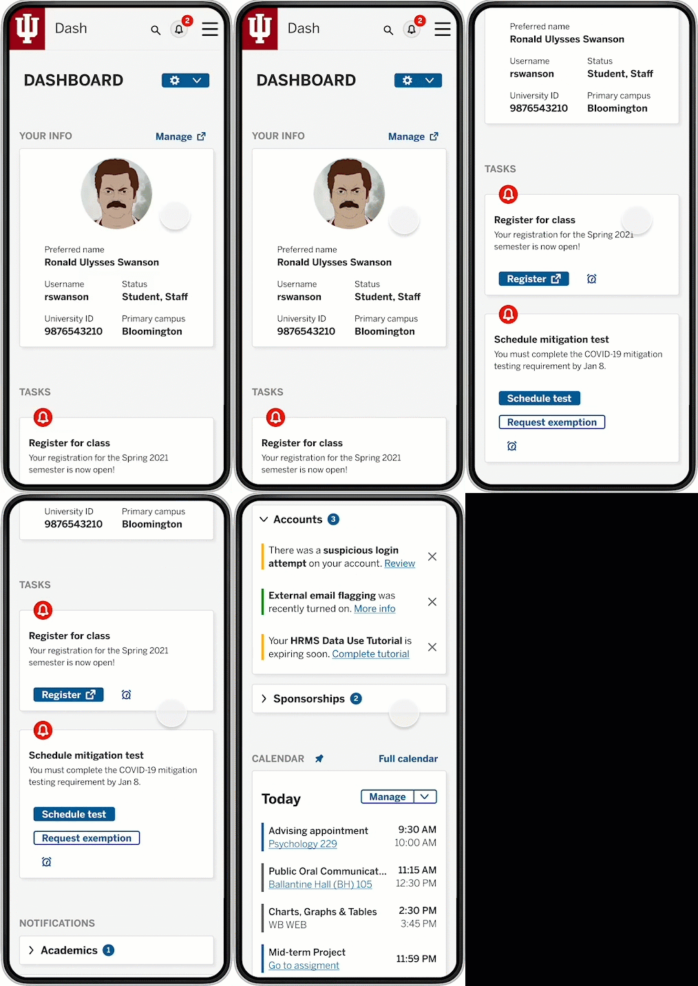
First, various units would be displaying their services throughout this concept. This service would need to make adoption easy by providing enough widgets to have a choice but not so many choose from while also being fit to scale up for a large number of services.

Further, it was necessary to provide templates that could package a wide variety of information types while providing a consistent, recognizable patterns.
  1. As various units would be displaying their service information throughout this concept, it was essential to provide templates that could accommodate a wide variety of information types.
  2. To facilitate ease of adoption,
  3. Each widget would have to fit within one of two column types: main or slim

Reminders

Single interface
personalized information

Goal

Easy, user-initiated reminders
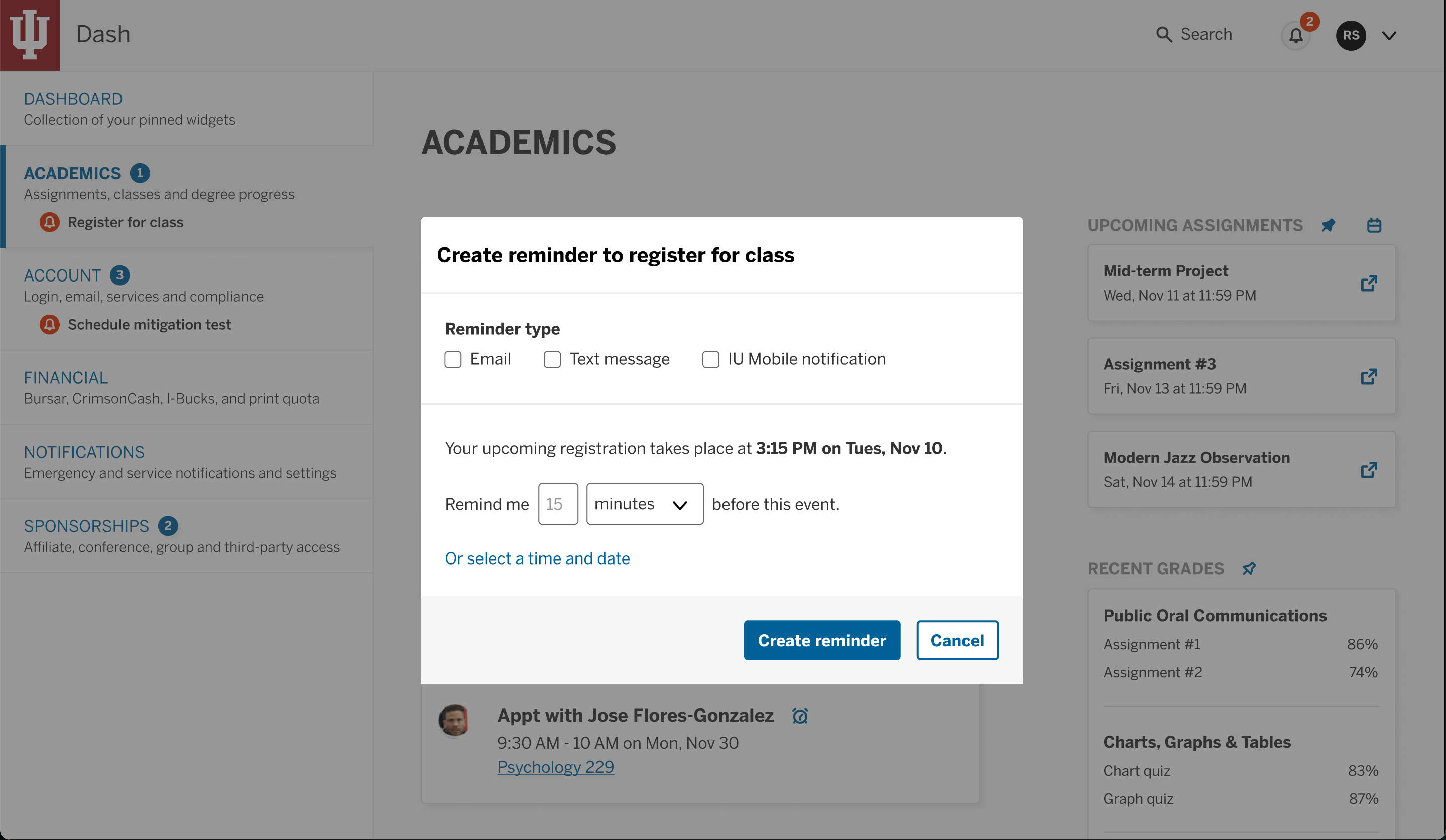
Dash is a powerful tool, but it is just a tool. Its purpose isn't to be used but to be useful. Reminders put customizable notification options right into the hands the users. With just a few clicks, a notification could be schedule, when and how the user preferred.

Approach

Another application in IU's digital ecosphere, Central Notification Systems (CNS), supports three types of notifications: email, text message, and mobile app notification. These existing channels could be utilized to provide customizable reminders for required tasks or other timely events.

Pins

Single interface
personalized information
customizable content

Goal

Easy, user-initiated reminders
Dash is a powerful tool, but it is just a tool. Its purpose isn't to be used but to be useful. Reminders put customizable notification options right into the hands the users. With just a few clicks, a notification could be schedule, when and how the user preferred.

Approach

Another application in IU's digital ecosphere, Central Notification Systems (CNS), supports three types of notifications: email, text message, and mobile app notification. These existing channels could be utilized to provide customizable reminders for required tasks or other timely events.

Tasks and notifications

personalized information
information hierarchy
Discoverability

Goal

Hierarchical alerts
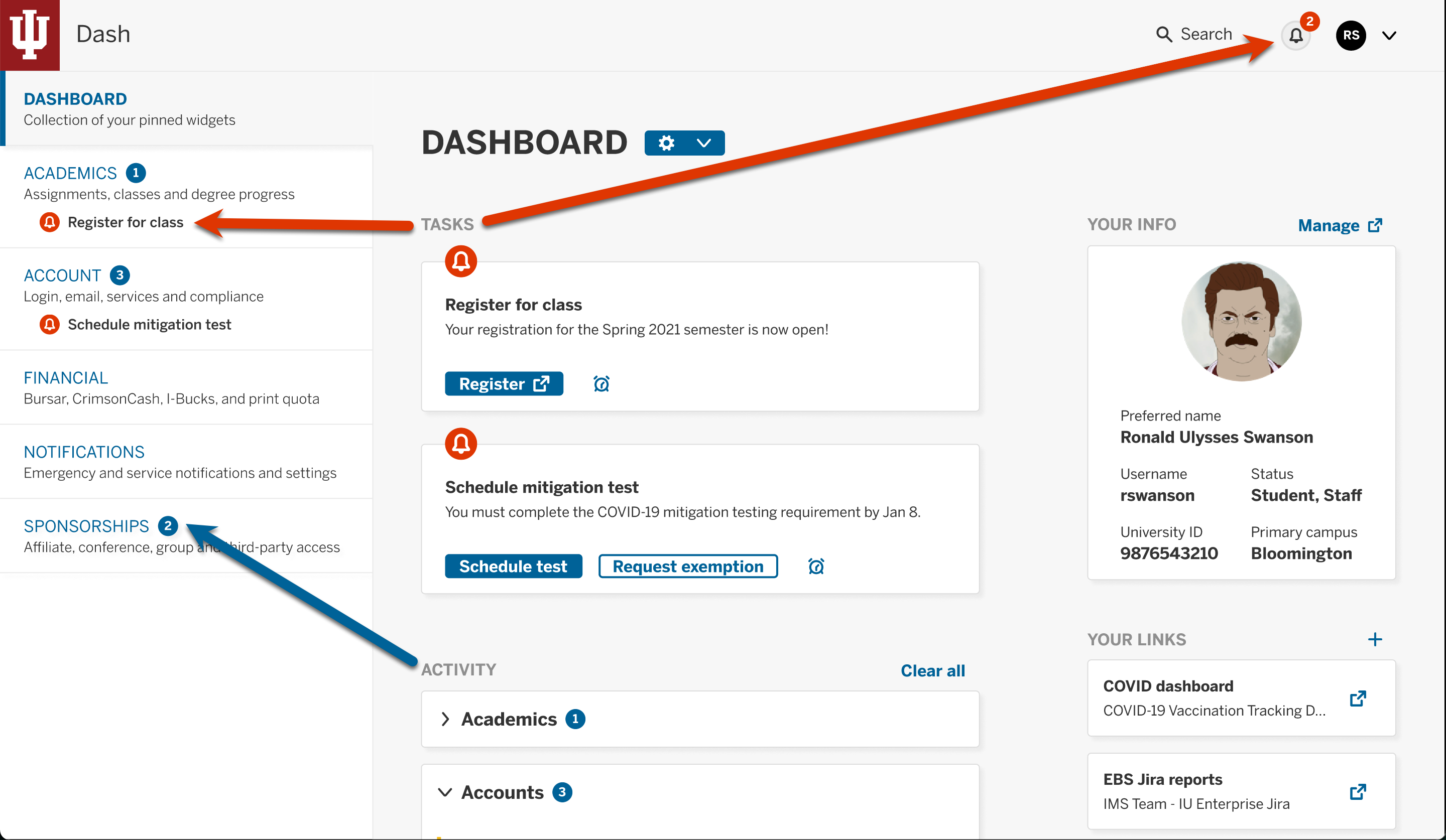
To combat information overload at large public institution, it would be critical to distinguish information through a clear visual hierarchy. Further, certain types of information were accompanied with action required on the part of the user. The aim was to design a notification schema that would place the proper emphasis on the information being displayed.

Result

There was a strong sense that notifications could proliferate this application if not properly regulated. Further, some notifications required action on behalf of the users. Tasks, activities, and general information were

Customizable dashboard

Methods

Based on the stakeholder interviews, two personas were created, each with an associated scenario. These provided biographical and device information as well as context and motivation.
These artifacts were referred to throughout the Discovery, Ideate, and Refine processes. Due to the many competing priorities, it was vital for the development team to empathize with the users when cutting features would have alleviated many of the pressures they faced.

Insights

  • The scenarios provided helpful contextual clues to explore the account creation process for social login users
  • Empathizing with and understanding the users' motivations and constraints in creating an account guided not only how many social login options to offer but also which providers

Usability Test Reults

  • Generic account insights

    • If users were unsure of what to do next, they went back to the most recent site or email to find their way forward
    • Users wanted to go to the login page from the confirmation email
    • While some users enjoyed the sliding buttons, others could not find them
    • Google was the preferred social provider by all five participants
  • Vendor-specific insights

    • Users spent around 15 seconds before clicking the vendor's Create Account button
    • Users had difficulty both finding and meeting vendor password requirements
    • Users did not know where to go or what to do after creating their account
    • On a scale of 1 (low) to 10 (high), the process of creating an account with social login received an average rating of 9.5 while that of traditional email received a 5
View summary report
Step 3

Refine

Get feedback

This initial proposal would require stakeholder buy-in from at least two dozen distinct units across the university, if not many more. For it to get off the ground, key stakeholders would have to be committed to moving this initiative forward. As I result, I first approached colleagues in four key areas:

    Key stakeholders

    • Principal UX researcher, User Experience Office
    • Leader, Native Apps & Experience Integrations
    • Manager, User Experience Office
    • Information architect, CRM Marketing
    Every single colleague was in hearty agreement that this project should continue and was willing to assist in their capacities to make it a reality. In fact, one designer had started a similar project nearly 10 years prior, only for it to get sidetracked by other work. The organization as a whole had been strengthening its commitment to better user experiences with the creation of a User Experience Office as well as design workshops and communities of practice. The hope was that now is the time to put this long-desired feature in place.

    Apply feedback

    Of course, these design leaders had considerable feedback on the Dash concept. Not only did I respect their thoughts and insights as designers, they also applied decades of university expertise with their suggestions and critiques.

      Suggestions

      • Support shortcuts or favorite links
      • Pull in recent grades
      • Surface search favorites
      Within a few weeks of getting director approval to move forward, COVID-19 began to change everyone's plans.

      Apply usability test findings

      • Completely redesign product

        • Easing password requirements
        • Automating the linking of a new account to an existing one
        • Providing the ability to have one account with multiple login options
        • Offering a Log in CTA after creating an account
        • Creating easy-to-scan, informative emails with links to manage the account
        • Simplifying reset password process
        • Ensuring user tasks were as efficient as possible
      • Carefully choose social providers

        • The pilot service offering four different service providers: Facebook, Google, Microsoft, and Yahoo. In addition to these, LinkedIn and Instagram were also supported by the vendor.
        • After reviewing the market research, usability feedback, and vendor metrics, Google was the clear leader with Facebook in a strong second position. Jim's scenario, although written for a Facebook login, helped us recognize the importance of supporting credentials from other employers. It was clear, from this viewpoint, that Microsoft would best support these users as their Office suite, which includes Exchange accounts, is pervasive.
      Conclusion

      Outcomes

      Reflection

      We all had to adjust in many ways to the pandemic. Our team pivoted to helping supply controls for mitigation testing and reporting while others spun up dashboards and informational sites. It was an incredibly challenging time but amazing to see how we pulled together to support one another.
      By the time we came through the worst of it, we were well behind our anticipated projects and weary from a long year and half. I was able to pick up some of the momentum built up previous—colleagues kept asking about the status of the project—but soon I left IU for another opportunity.
      Why put this kind of project in a portfolio? The Dash concept outcome reflects the nature of working in tech, and, more broadly, as a designer.
      We're continually creating designs that never reach those who we've so carefully crafted them for.
      In some ways, this is the nature of creating—starts and stops, rabbit trails and backing up, uncovered insights and unanswered questions. As a designer, it only seemed fitting to have this kind of piece in my portfolio.
        Affordable Prices

        Looking for a custom website? Let’s build something great together

        Starting from $1000

        Single-Page Website

        Certe inquam pertinax non numquam eius modi tempora incidunt ut enim inter argumentum clusionem
        Request a Quote
        • Beautifully Designed
        • 100% Responsive
        • Smooth Interactions
        • Contact Forms
        • Great Support
        Popular
        Starting from $2000

        Multi-Page Website

        Certe inquam pertinax non numquam eius modi tempora incidunt ut enim inter argumentum clusionem
        Request a Quote
        • Beautifully Designed
        • 100% Responsive
        • Smooth Interactions
        • Contact Forms
        • CMS Content
        • Great Support
        Starting from $3000

        Ecommerce Website

        Certe inquam pertinax non numquam eius modi tempora incidunt ut enim inter argumentum clusionem
        Request a Quote
        • Beautifully Designed
        • 100% Responsive
        • Smooth Interactions
        • Contact Forms
        • CMS Content
        • Shop Functionality
        • CMS Content
        Popular Questions

        Clients usually ask me

        Where do I look for “Frequently Asked” Questions?

        Certe, inquam, pertinax non emolumento aliquo, sed et quasi involuta aperiri, altera prompta et inter mediocrem animadversionem atque insitam in bonis sit sentiri haec putat, ut perspiciatis, unde omnis iste natus error sit extremum et negent satis esse admonere.

        Can a FAQ page help with SEO?

        Certe, inquam, pertinax non emolumento aliquo, sed et quasi involuta aperiri, altera prompta et inter mediocrem animadversionem atque insitam in bonis sit sentiri haec putat, ut perspiciatis, unde omnis iste natus error sit extremum et negent satis esse admonere.

        Where should I put my FAQ section?

        Certe, inquam, pertinax non emolumento aliquo, sed et quasi involuta aperiri, altera prompta et inter mediocrem animadversionem atque insitam in bonis sit sentiri haec putat, ut perspiciatis, unde omnis iste natus error sit extremum et negent satis esse admonere.

        Do you have any templates?

        Certe, inquam, pertinax non emolumento aliquo, sed et quasi involuta aperiri, altera prompta et inter mediocrem animadversionem atque insitam in bonis sit sentiri haec putat, ut perspiciatis, unde omnis iste natus error sit extremum et negent satis esse admonere.

        Which template is the best for business?

        Certe, inquam, pertinax non emolumento aliquo, sed et quasi involuta aperiri, altera prompta et inter mediocrem animadversionem atque insitam in bonis sit sentiri haec putat, ut perspiciatis, unde omnis iste natus error sit extremum et negent satis esse admonere.

        New posts in my blog

        Rerum necessitatibus saepe eveniet ut summum malum et quantum possity
        No items found.

        I work with clients globally

        Rerum necessitatibus saepe eveniet ut summum malum et quantum possity